
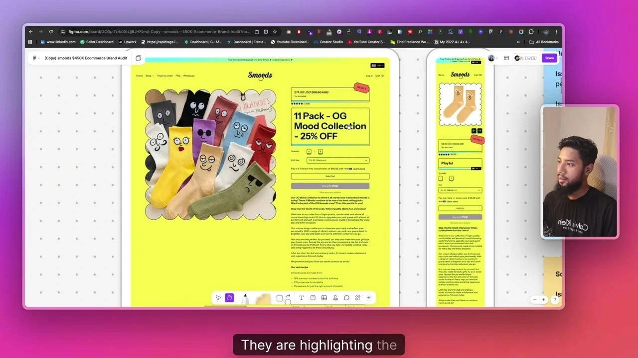
A $450K sock brand looks successful from the outside. But when conversion specialist Azi ran a full audit on it in this video, homepage to checkout, he found small leaks everywhere. Here’s what he caught, page by page.
Top Bar & Navigation
- Free shipping banner has no clear offer or action, just a shipping message sitting there doing nothing
- No “Shop Now” button to actually push people forward
- Header uses plain text links instead of icons, slower to scan
- No bestseller highlighted in the nav, so new visitors don’t know where to start
- Currency switcher barely works and sits in a confusing spot
Hero Section
- Doesn’t clearly show what the product is or who it’s for
- No lifestyle image showing the product in use
- Thousand-plus reviews exist but aren’t shown here, where they’d matter most
- Missing simple benefit bullet points near the headline
Trust & Social Proof
- Strong sales numbers and reviews exist, but they’re buried instead of front and center
- No dedicated trust bar (guarantee, made-in-country, etc.) under the header, even though heatmaps show that’s the one spot everyone sees
- Reviews are missing verified buyer badges, photos, dates, and locations, so they don’t feel fully trustworthy
Product Grids & Collection Pages
- Out-of-stock items aren’t labeled, so people click and hit a dead end
- No “add to cart” button directly on product cards, even though prices are low enough for impulse buys
- Collection pages require way too much scrolling with no filters or bestseller markers
Mega Menu
- Dropdown shows categories only, no product images, pricing, or reviews
- Hovering doesn’t preview anything useful, so it doesn’t help people shop faster
Product Page
- Price, reviews, and size options aren’t grouped in a way that guides the eye
- No sticky add-to-cart bar, easy to lose the buy button on a long page
- No comparison section, even though competitors are easy to find in a quick search
- FAQ section is missing, so common objections go unanswered
Cart & Checkout
- Empty cart state feels like a dead end instead of guiding people back to products
- Shipping cost isn’t mentioned until checkout, creating price-shock friction
- Checkout page has no trust badges or review snippets near the payment button
The Takeaway
None of this needs a full redesign. It’s a list of small, fixable gaps, the kind you only catch by walking through your own site like a first-time buyer. If a $450K brand has this many, yours probably does too.