
Chompshop
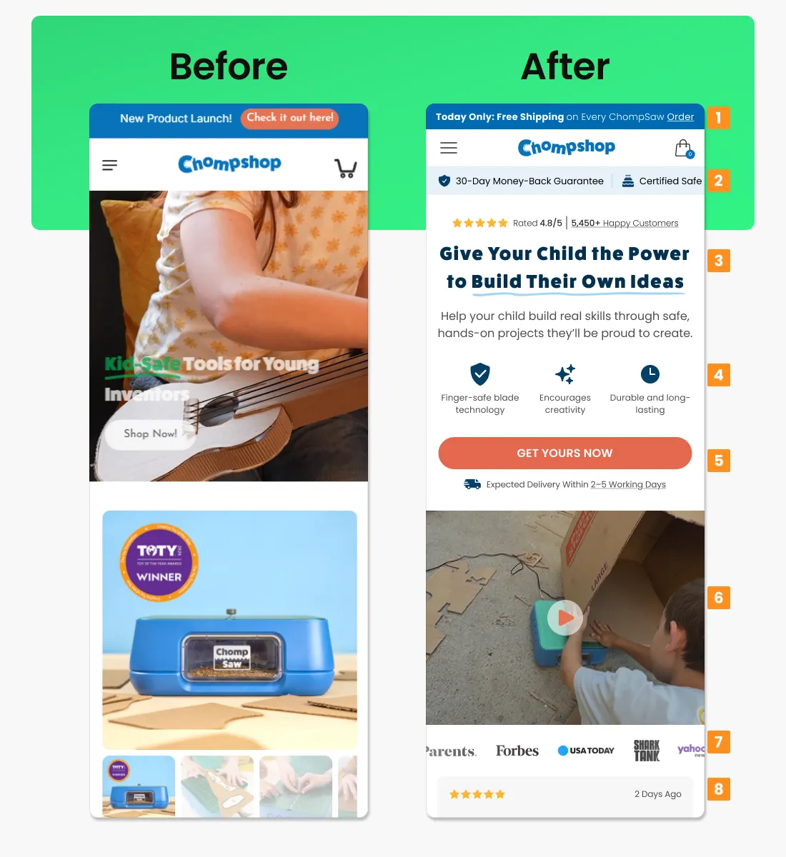
The original hero was fine, just forgettable. A “new product launch” banner and a nice lifestyle photo, but nothing telling you why you should actually care. Here’s what changed:
- That launch banner is gone, replaced with a free-shipping deal that only lasts today. Way more likely to get someone to click.
- Right under the header, there’s now a money-back guarantee and a safety badge. If you’re buying a saw for your kid, that’s exactly what you want to see first.
- The headline stopped talking about the product and started talking about the kid. “Give Your Child the Power to Build Their Own Ideas” lands differently than a generic tagline ever could.
- Three small icons spell out exactly why the thing is safe and worth the money, instead of making shoppers guess from a photo.
- The buy button now sits next to a delivery estimate, quietly answering “how long will this take” before anyone has to ask.
- Instead of a static “Toy of the Year” badge, there’s a video of a real kid actually using it. Far more convincing than an award sticker.
- Press logos from Forbes, USA Today, and Shark Tank show up further down, a nice trust boost for anyone still on the fence.
- And right at the bottom, a review timestamped two days ago. Recent, specific, human.
Mud Daddy
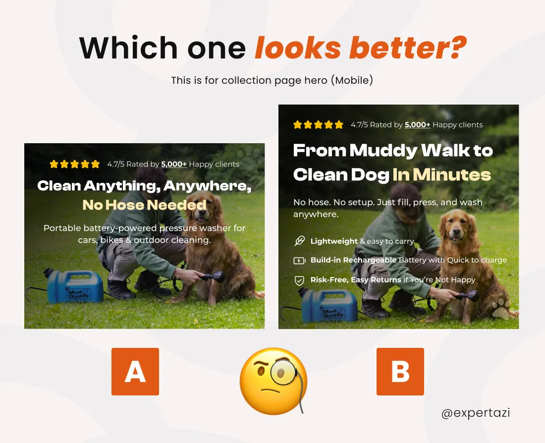
This one’s a smaller test: same layout, same rating, just different words. But look at how much more work Version B’s headline is doing.
- “Clean Anything, Anywhere, No Hose Needed” is fine, but it’s talking about the product. “From Muddy Walk to Clean Dog In Minutes” talks about your actual afternoon, which is the real win.
- The subheadline shrank down to basically three words: fill, press, wash. No fluff left.
- Instead of one generic description line, there are now three clear reasons to buy: it’s light, the battery charges fast, and returns are easy if it’s not for you.
Ritual
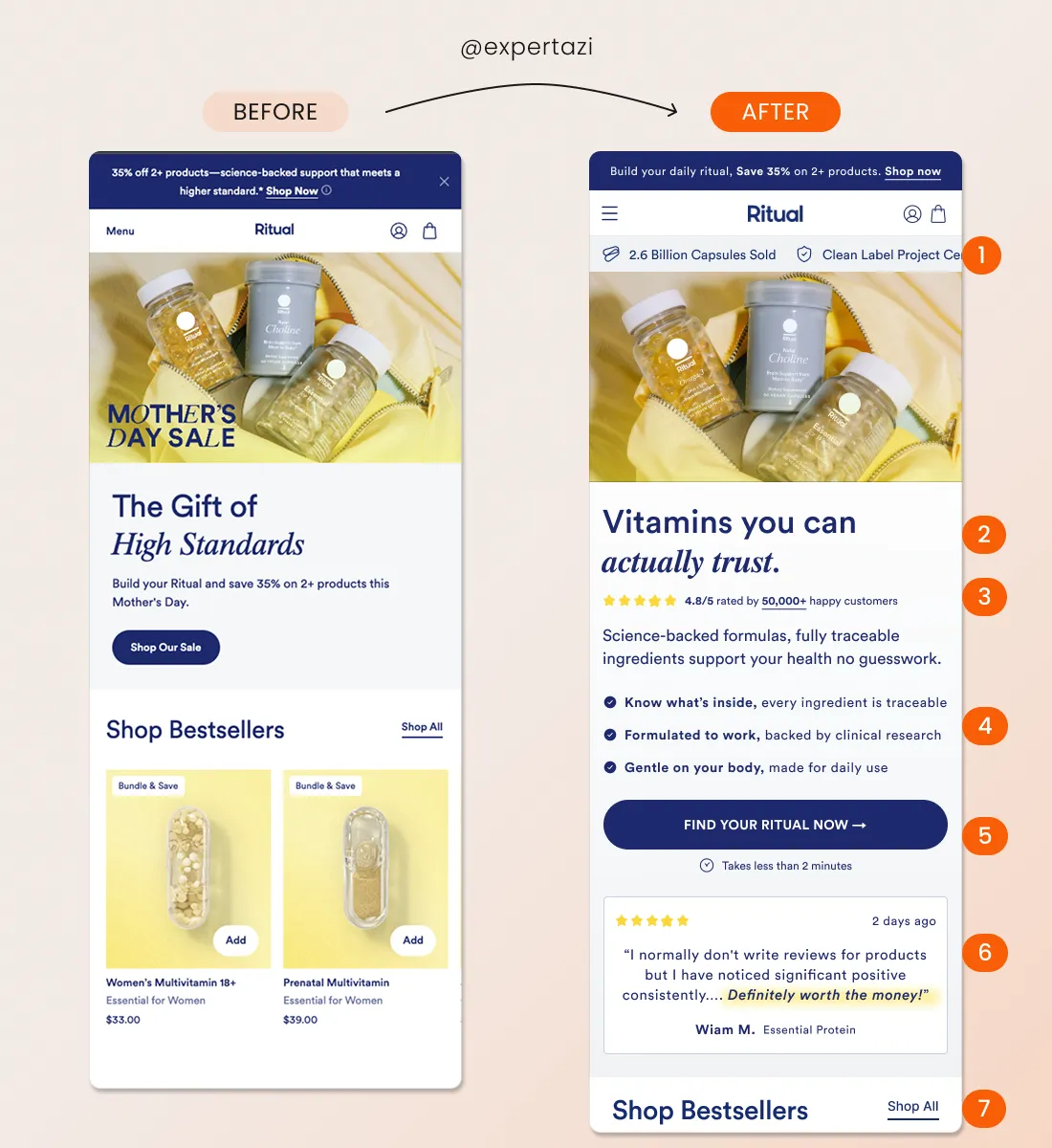
Ritual’s original page leaned almost entirely on a Mother’s Day discount, which is a problem for the other eleven months of the year. The redesign drops the seasonal angle for something that works every single day: trust.
- A new bar under the header leads with hard numbers, like billions of capsules sold and a clean-label certification. Hard to fake, easy to trust.
- The headline flipped from gift-giving language to a flat, confident statement: “Vitamins you can actually trust.” It doesn’t need a holiday to make sense.
- A 4.8-star rating from over 50,000 customers now sits right up top, doing a lot of the persuading before anyone even reads the copy.
- Three short lines translate “science-backed” into things people actually care about: traceable ingredients, clinical backing, gentle on the body.
- The button copy got specific (“Find Your Ritual Now”) and picked up a small reassurance that it takes less than two minutes. Small detail, but it kills the “ugh, this’ll take forever” feeling.
- A real testimonial, dated two days ago with one line highlighted, reads like an actual person wrote it rather than a marketing team.
- The bestsellers section stayed exactly where it was. No reason to remove an easy next step for people ready to buy.
ToothFairy
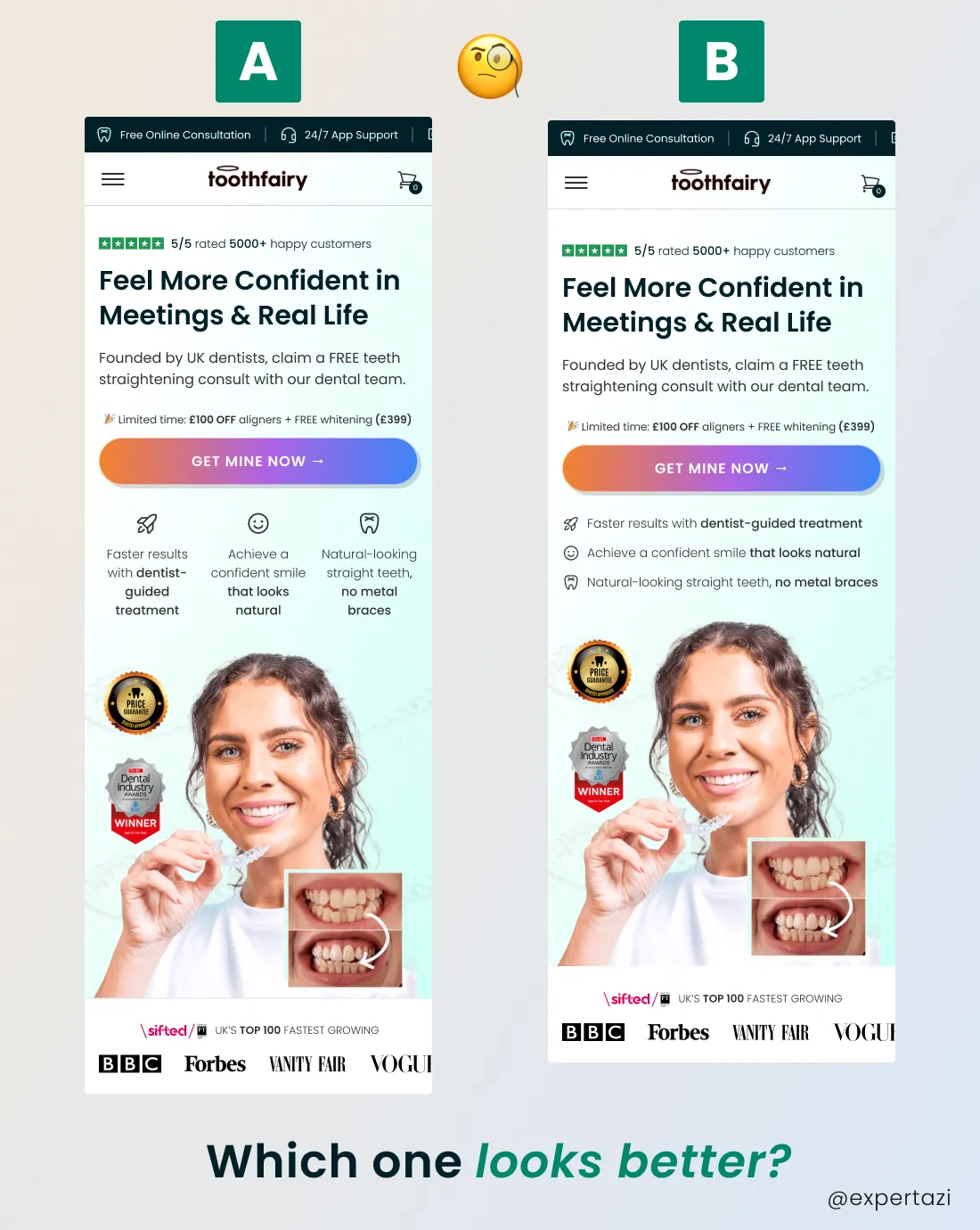
This is the subtlest example on the list. Same headline, same offer, same button in both versions. The only thing that actually changed is how the three benefits are laid out.
- Version A stacks an icon and a caption underneath it, repeated three times. It looks clean, but it takes a few seconds to read through.
- Version B lines up the same three benefits as a simple list: icon, bolded phrase, one line of support. Same information, half the reading effort.
- It’s a good reminder that conversion work isn’t always about writing new copy. Sometimes it’s just about making the copy you already have easier to scan.